Compelling content that converts, online and offline, to more clicks, greater awareness, more sales…

Crafting a Distinct Online Presence for an Architectural Firm

Copywriting for Architects | A Case Study

It was immediately clear to me that the practice needed entirely different messaging to clear the clouds of ‘old-schoolness’ and ‘fustiness’ from the firm and to communicate the creativity, joy and enthusiasm the team genuinely shared for their solid design achievements, expertise and experience.
 

How Connected Copy helped transform one architecture practice’s ‘professional but dull’ website into one that’s dynamic, distinctive and different.

Miller Bourne Architects (MBA) is a leading architectural practice in Southeast England. It’s led by four experienced Partners and bolstered by a team of creative and vibrant design professionals.
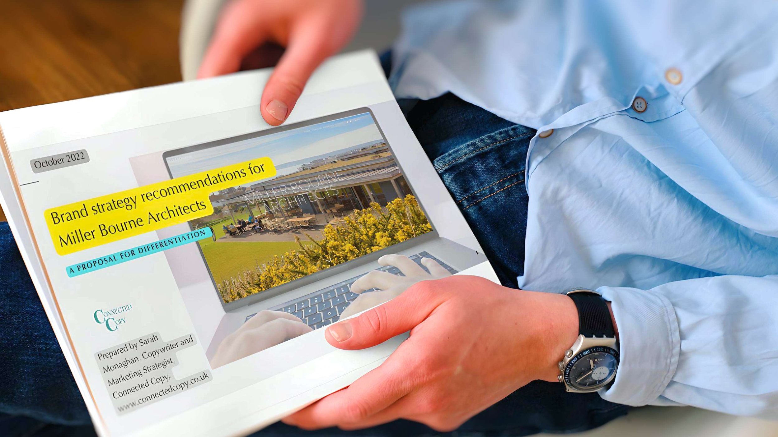
MBA approached
Connected Copy as they were planning an overhaul of their website.

Their verdict on the existing website? In their words, it felt "dated," "too earnest", and was suffering from a "lack of cohesive brand strategy." They saw their online presence as a mirror image of countless other architecture firms' websites – it just didn't stand out. 

Recognising these challenges, we embarked on a creative journey together. Our goal was clear: to redefine how MBA's architectural expertise is showcased, to articulate the ethos of their practice and to carve out a distinct, competitive niche for them in the architectural landscape.

The team were in a fog about what would make them stand out in the crowd. In marketing speak, they were grappling with how to define their USP.

So, we rolled up our sleeves and dove in.

Services

  1. Brand Positioning

  2. Creative Website Direction

  3. Copywriting All Website Pages

  4. Firm Profile and Team Bios

  5. Client Interviews and Testimonials


Connected Copy was founded by me, Sarah Monaghan, a former BBC journalist and senior copywriter.

We help architectural and design firms, and other professional services firms, enhance their brand and online presence and solve their marketing challenges.


Miller Bourne Architects (MBA) had a website that was the digital equivalent of a plain vanilla brochure (have a look at the image). It was all business and little client focus.

Yes, it looked 'professional' – but it missed out on a key ingredient: personality. The site felt as though the practice was playing a game of hide and seek, choosing to tuck itself behind a veil of professionalism. It didn't showcase the firm's strengths or the dynamic team driving its success.

Miller Bourne Architects’ website before the re-brand

While the architectural portfolio was visually impressive, the images depicting the architects' design studio and their team lacked vibrancy and appeal. They were more shadow than light.

Most crucially, the website wasn’t answering the big questions on every prospective client’s mind: “Do their services resonate with me? Will they get where I'm coming from? What are their standout projects? What unique value do they bring to the table? What’s it like to collaborate with them? Can I put my trust in them?”

It was time for a change, and that's exactly what we brought to the table.

Research and Discovery

The first step was an audit of Miller Bourne Architects' (MBA) existing website. This was all about pinpointing what worked well and what needed improvement, setting the groundwork for the new site's creative direction.

The audit gave valuable insights to offer practical suggestions for improving the information architecture and structure of the website plan, messaging, visual appeal, SEO and user experience.

Amid our discussions, we sparked ideas for the new website and identified the key client groups they needed to charm: Contractors, Local Authorities, Developers, and Independent School Bursars. It was all about shaping a narrative that resonated with these specific audiences.

Alongside this, we carried out a Brand Strategy Discovery Exercise. This involved delving into MBA's business environment, exploring their competitive landscape, understanding their client base, and defining their mission, vision and values. This exercise was crucial in identifying MBA's unique strengths and value proposition in the market.

To kick things off, each of the Partners at Miller Bourne Architects (MBA) completed a detailed questionnaire to give a variety of perspectives and to see just how in sync their views were. This was the first step in painting a picture of their brand and understanding their differentiators.

Next up, we gathered at the firm’s office for a face-to-face workshop. The aim? To sift through the responses and weave together the many strands of their practice's story. It was a dynamic session where we aligned on their core values, mission, vision, and purpose.

The goal was to establish a definitive positioning and personality for MBA. To do this, we went through an immersive discovery process.

Voice-of-Customer (VoC) Research

The original website of Miller Bourne Architects (MBA) seemed like it was more of an architect-to-architect conversation, missing the mark in connecting with their actual client base. It was clear that the new website needed a fresh approach, one that actually ‘spoke’ to the diverse clients MBA serves.

To get under the skin of these clients, we interviewed a cross-section of MBA's key clients. These were school estate managers, local authority building programme managers, design leads at construction firms and land managers at housing development companies.

The insights from these customer conversations weren’t just enlightening; they became the backbone of the new website’s copy. We incorporated actual phrases and terms that the clients used. This approach meant the website ‘spoke their language’, quite literally.

The interviews shed light on what the clients valued in MBA's work and what they expected from an architectural firm. For example, we found independent school bursars prioritised stunning architectural designs to impress parents, whereas commissioners of local authority school buildings were much more focused on cost-effectiveness and designs that stood the test of time.

Armed with these customer perspectives, we were able to tailor the website's content to resonate more deeply with each client group.


Repositioning, redefining, reimagining MBA ...

 The recommendations for the new site included:

  1. Developing a confident unique value proposition for the all-important homepage, encapsulating the architectural firm's essence and approach. A value proposition is a promise of value to be delivered, communicated, and acknowledged. It is also a belief from the customer about how value (benefit) will be delivered, experienced, and acquired. Creating the right one for Miller Bourne took time and discussion, but the result immediately tells the visitor what the practice does and what makes it special and different: “Beautiful, sustainable and sound buildings for people, place and planet.”

2. Writing in a more personal, forthright and confident tone of voice. This was to clear the clouds of 'old-schoolness' and 'fustiness' of the firm and to communicate the joy and enthusiasm the practice genuinely shares in its solid design achievements, expertise and innovative client work.

3. Opting for an interactive, modern website design with parallax scroll and clean layout.

4. Enhancing MBA's branding with bolder fonts, colors, and images to raise its perceived value and memorability.

5. Expanding the 5-page website to a 20+-page site, emphasising MBA's expertise and improving SEO visibility for the architectural practice.

6. Adding new pages on Sustainability, Building Information Management, Modern Construction Methods, Masterplanning, and the RIBA Process.

MBA has earned an enviable reputation as an architectural specialist in the educational sector, crafting buildings for schools and colleges. But the breadth of its experience goes way beyond this and includes the residential, community, leisure, and commercial sectors.

It wanted to highlight its educational design prowess but didn’t want to be pigeon-holed by it. It was keen, too, to showcase its expertise and strengths in other sectors.

7. Crafting SEO-friendly URLs, titles, meta-descriptions, keywords, and 'hidden' SEO targeted pages to boost online findability to increase the practice’s visibility for terms such as ‘Brighton architects’ and ‘Sussex architects’..

8. Commissioning new relaxed brand imagery taken beside the sea to emphasise the coastal location of their practice. So, the whole team was photographed on the beach at Brighton and also at work in their open-plan and bright and airy studio. Colourful beach huts were used as backdrops for the individual staff shots that we planned to use for the team’s bios to define a consistent visual identity.

9. Incorporating client testimonials throughout the site as powerful social proof supporting the new UVP. Testimonials are a powerful form of social proof. Recommendations and endorsements from satisfied clients are a great way to build trust and communicate a sense of what it’s like to work with you. Best of all, they let others do the bragging for you.

10. Reframing the 'Practice' page to focus on clients, integrating the firm's new 'Shared Values'.

11. Moving away from the usual way practices list their specialisms under types of architecture, ie. Leisure, Residential, Commercial etc. Instead, we created four client-centric entry points, with unique landing pages that addressed the specific priorities of each client group.

12. Highlighting the architectural firm's dependability and attention to detail, aspects highly valued by clients, throughout the website copy.

13. Creation of lively and engaging personal bios for each team member, rather than the previous glorified CVS. We even included bios for the practices’s two dogs – also important ‘staff members’ (!) – to give a sense of the relaxed, happy and creative place that MBA is to work.

14. Creating a 'Journal' section for news and thought-leadership content, enhancing online visibility and SEO ranking.

Website Design

Now ready to share the finished copy, it was time to move the website into development.

We created a visual mock-up of the suggested home page hierarchy and look as a guide to share, along with the Brand Strategy Document, with the website designer: James Richardson of www.groundnation.com.

The marked-up copy for all pages went to James, with suggestions for hierarchies, layouts, fonts and styling, image types, and calls-to-action (CTAs) etc.

“The marked-up copy with H-tags and meta-tags was very helpful for the flow and structure. It's not something I’m often supplied with by copywriters,” said James.

He added: “Connected Copy’s Brand Strategy Document was a really useful reference for the website development. It gave guidance on the company aspirations for tone and visually, it helped inform the website design."

Working with Connected Copy, James said, meant:

  • “It took an amount of project management away from me.”

  • “There was another pair of eyes on the project (other than the client’s).”

  • “The content was focused on the client. Often, strong copywriting is sadly overlooked.”

– RICHARD MORRICE, PARTNER, MILLER BOURNE ARCHITECTS

“From our initial meeting with Sarah of Connected Copy, we felt confident to let her take control of the project. She led us through a positioning discovery process, identifying our key messaging and USPs.

She brought our strengths into focus and shone a fresh light on how we could sell ourselves. We're delighted with the final result – it’s a transformation. Sarah gave creative direction for the site's functionalities, visual look, and photo shoots.

She delivered lively and informative copywriting that has also ensured strong SEO for findability. We’ve now an engaging website that showcases a new and distinctive visual and verbal identity. We're thrilled with the site!”


FREE RESOURCE: ENHANCING ARCHITECTURAL FIRM WEBSITES

14 Instant Upgrades for Design & Communication (with real examples)